Defining the edge of motion. One page, the whole system: name, mark, color, type, voice, environments, motion. Locked decisions are labeled. Everything else is open within them.
01 // Naming [LOCKED]
The Name
Cascade leads, Pixel follows. Never "PixelCascade." Organic flow first, technical precision resolves it. The name encodes the work (the unbroken chain of frames, resolved at the smallest controllable unit) and the geography (Bay Area roots, Cascade foothills operating ground): an emissive pixel of digital creativity inside a vast natural cascade.
Cascade Pixel
Two words, title case. Body copy and formal references.
CASCADEPIXEL
One word, all caps, Archivo Bold. The typographic wordmark in the logo lockup.
Defining the edge of motion.
The locked tagline. Hero, social bios, email signatures, any one-line context.
02 // Logo System [LOCKED]
Two States, One Mark
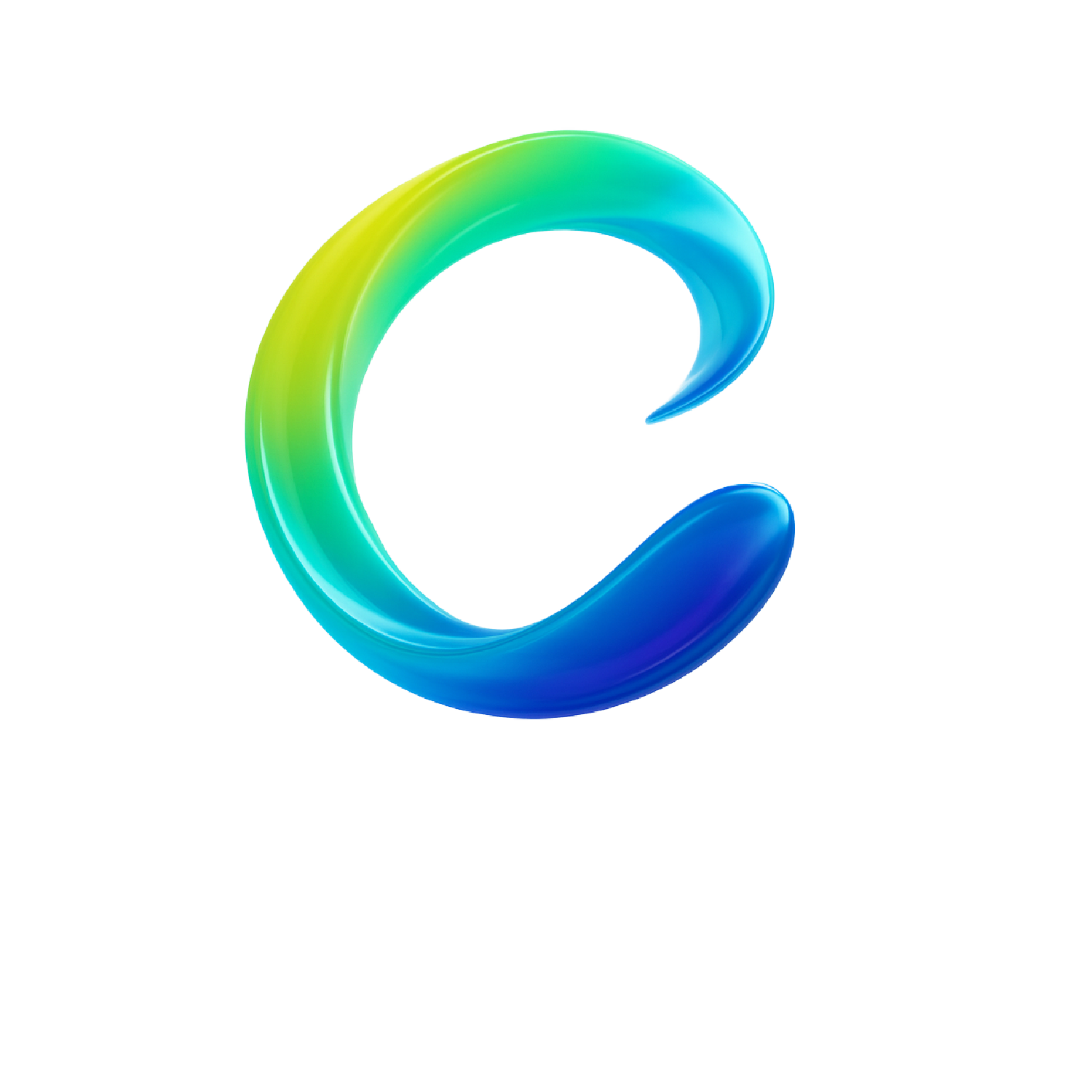
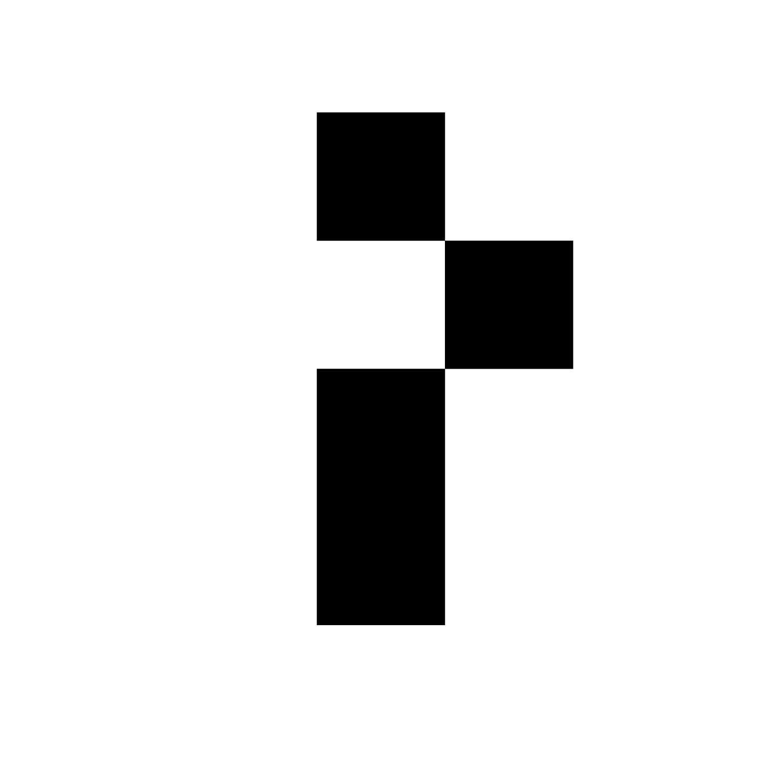
The identity holds the brand's central tension. The C is the fluid state: liquid metal, lime-to-teal-to-cobalt, gravity-bound, alive. The P is the constructed state: voxel-derived black architectural mass, discrete and engineered. The lockup interlocks both so the mark carries the tension in a single image.
The C // Fluid State // renders on bone or white onlyThe P // Constructed State // lives in dark environments
Rules
Clear space: the height of the C, all sides
Minimum size: 32px on screen, 0.5in in print
Gradient C on white, bone, or values below 12% black
On dark grounds: P-only or wordmark with C reversed to bone white
Never
Rotate or distort the mark
Recolor the C gradient
Place the gradient C on a busy background
Render below 32px
03 // Color [ANCHORS LOCKED]
A Narrow Palette, On Purpose
Restraint is part of the brand. Five locked anchors plus one technical accent. New tones may live between the anchors, never in place of them.
Cascade Lime#C8E83Agradient origin // signal energy
Cascade Teal#2BC7B0gradient mid // flow
Cascade Cobalt#1E5DD8gradient anchor // structure
Substrate Black#0A0E12ground // weight
Bone White#F4F5F1field // breath
HUD Green#2BFF7Atechnical accent // use sparingly
The C-gradient // always continuous, painterly // banded gradients are off-brand
04 // Typography
Type System
Display [LOCKED] Archivo Bold uppercase // +0.05 to +0.10em
Edge of Motion
Body [OPEN // default] Inter sentence case
We engineer the visual systems that make advanced technology feel inevitable. Complex ideas explained simply; intelligence through clarity, not complexity.
Mono [OPEN] JetBrains Mono uppercase // +0.10em
CP.VALLEY // 42.3N 122.9W // SYSTEM STATUS: ONLINE
05 // Voice [LOCKED]
Elegant Engineer Meets Cinematic Architect
Crisp, confident, clear, anchored in wonder. The voice assumes the reader is intelligent and respects their time. Test: would the sentence feel out of place in a well-edited science magazine? If yes, rewrite. No em dashes, ever.
Crisp
No fluff, no buzzwords, no agency-template sentences. Every word earns its slot.
Confident
No hedging. Expertise demonstrated through specificity, not performed.
Clear
Complex ideas explained simply. Name the concept precisely, then translate to consequence.
Wonder
Cinematic and imaginative, but grounded in technical reality, not fantasy.
Off-brand
We create stunning, world-class motion graphics that deliver value for innovative brands.
On-brand
We make the visual systems that turn a product launch into the moment a category shifts.
The brand moves through three visual environments deliberately, often in a single composition. The homepage enacts the transition vertically. This page does too.
ENV.01
Clean Precision
Bone white field, negative space, editorial hierarchy. The C-gradient as the color event. Where the brand earns trust.
ENV.02
Technical Systems
Substrate black, voxel forms, wireframes, HUD green accents. 2030 future-realism, never 1998 holograms. Where the brand earns technical credibility.
ENV.03
Photoreal Natural
Forest valleys, volumetric fog, the glowing cube. Digital and natural coexisting. Where the brand earns its soul. Territory no other studio owns.
07 // Motion Principles [LOCKED]
Where the Brand Lives
M.01
Inertia is real
Objects have implied mass. Nothing snaps unless snapping is the explicit point.
M.02
Easing is asymmetric
Slow-out, fast-in, with a settle. Linear motion is reserved for systems and machines.
M.03
Cascading reveals
Sequential elements cascade in time; never pop in unison. The brand name made kinetic.
M.04
Pixel-discrete moments
Punctuating beats of grid-snap and quantized motion against the flow. The contrast is the brand.
M.05
Restraint at the climax
The most expensive frame is often the stillest one. Hold it.
M.06
Atmosphere over decoration
Backgrounds breathe; foreground elements move with intent.
08 // Service Lanes [LOCKED]
Four Lanes. One Operating Model.
01
Brand Films & Launch Assets
Cinematic launch films, hero spots, and campaign anchors.
02
Photoreal Visualization
Hardware, software, and system visualization for products and ideas.
03
UI/UX Motion
Interface motion, interaction explorations, and product-experience storytelling.
04
Creative Technology ServicesTHE WEDGE
AI-assisted pipelines, automation, and modern creative operations. What makes the other three lanes possible at a different cost-to-craft ratio.